Daniel Alonso
Brand Identity
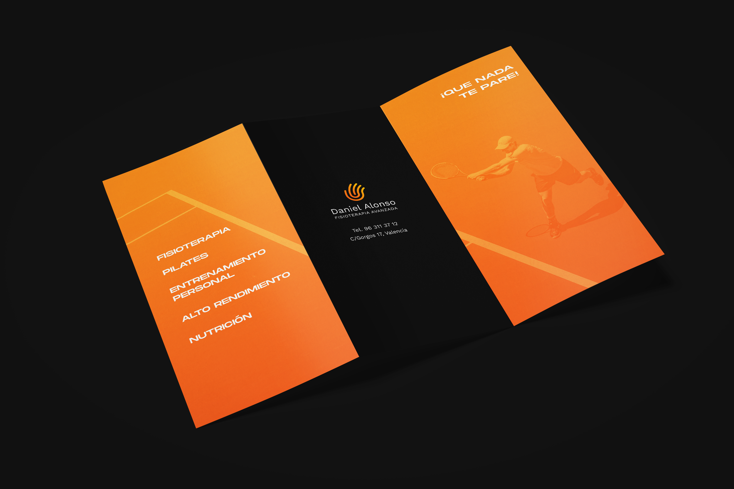
Daniel Alonso provides advanced physiotherapy focusing on sports-lovers, athletes and people who exercise regularly.
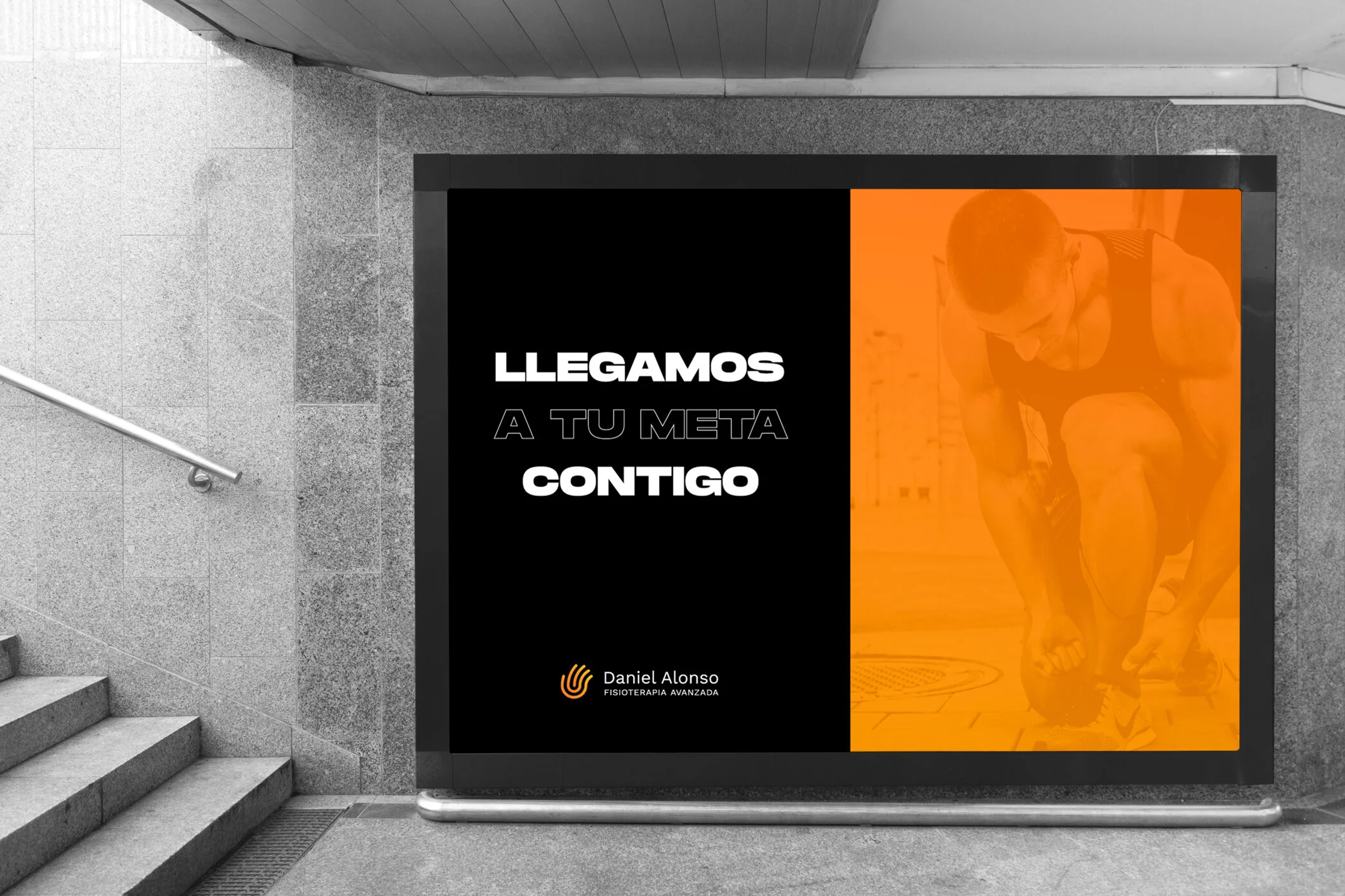
His motivation is to help clients feel better from the moment they enter the clinic. For Daniel, the human interaction is a vital part of the recovery process and gives special attention to understanding his patients worries and needs.
Taking all this into consideration, the symbol merges a hand- representative of the human touch- with magnetic waves that are related to the advanced technology.
The gradient color is inspired by the colors of the sun and conveys warmth, energy and strength.