Kai Poké
Naming & Brand Identity
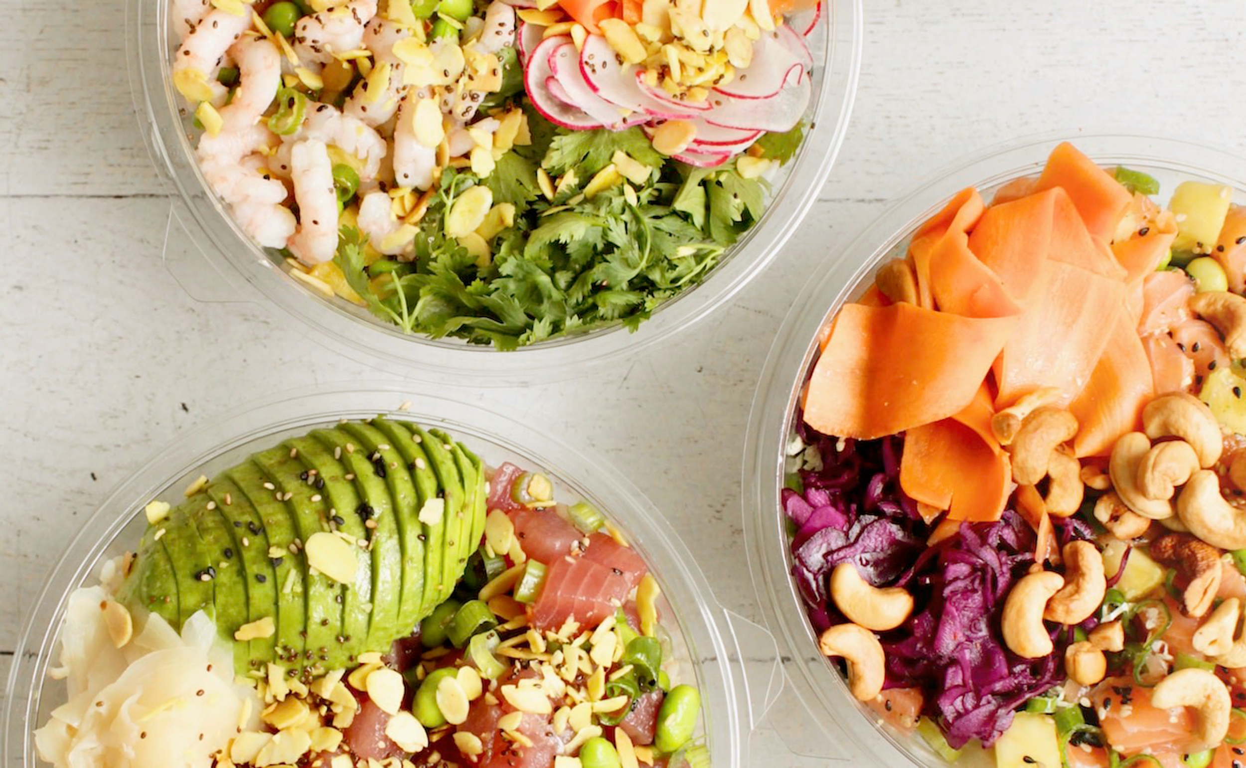
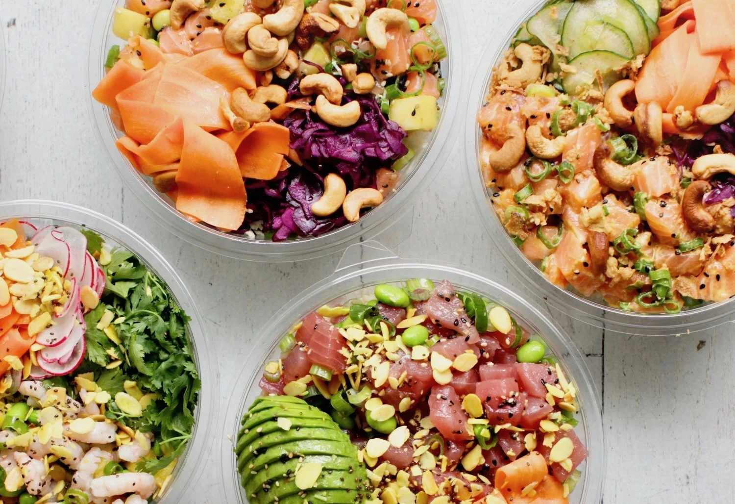
Kai Poké is a restaurant specialized in a traditional and popular Hawaiian dish served in a bowl: the poké. Raw fish is one of its main ingredients.
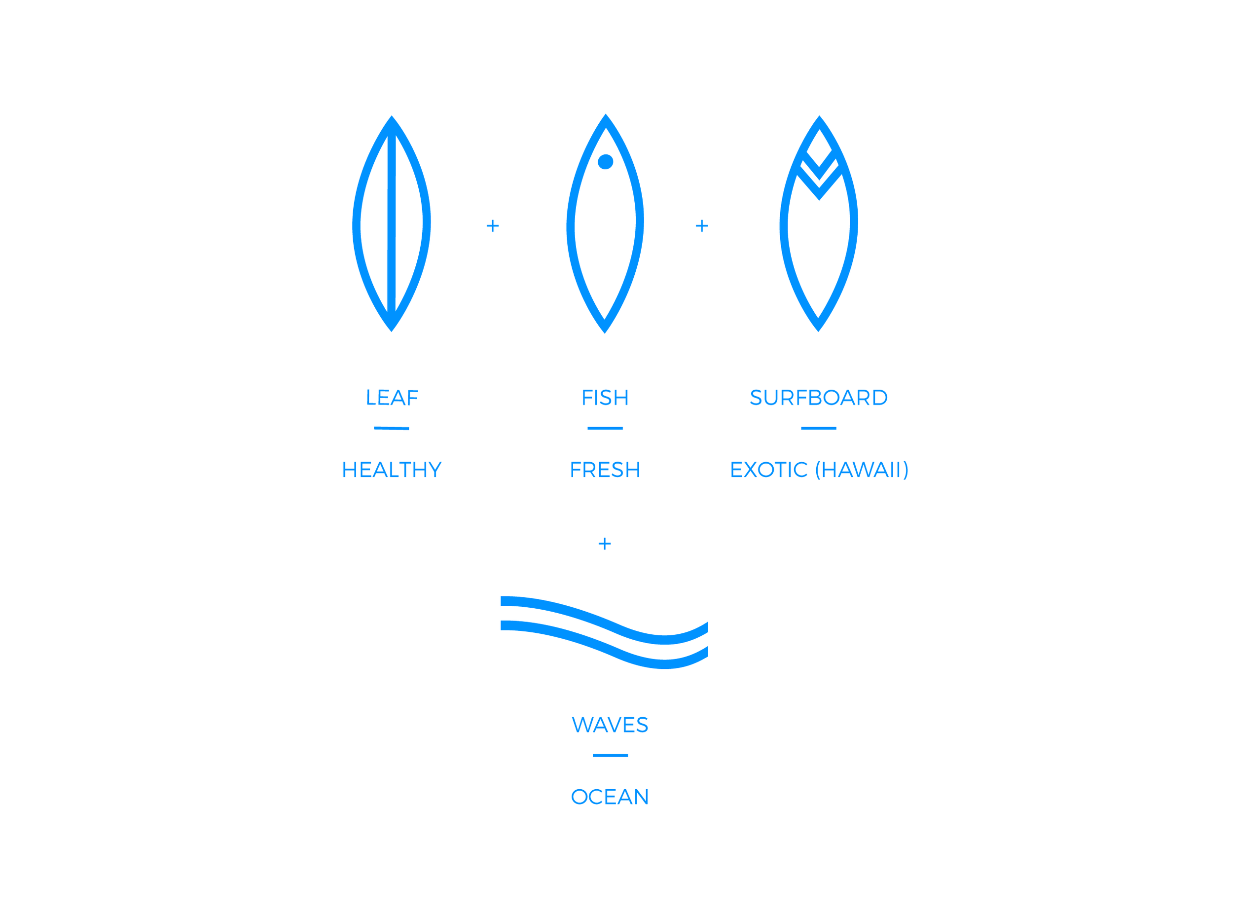
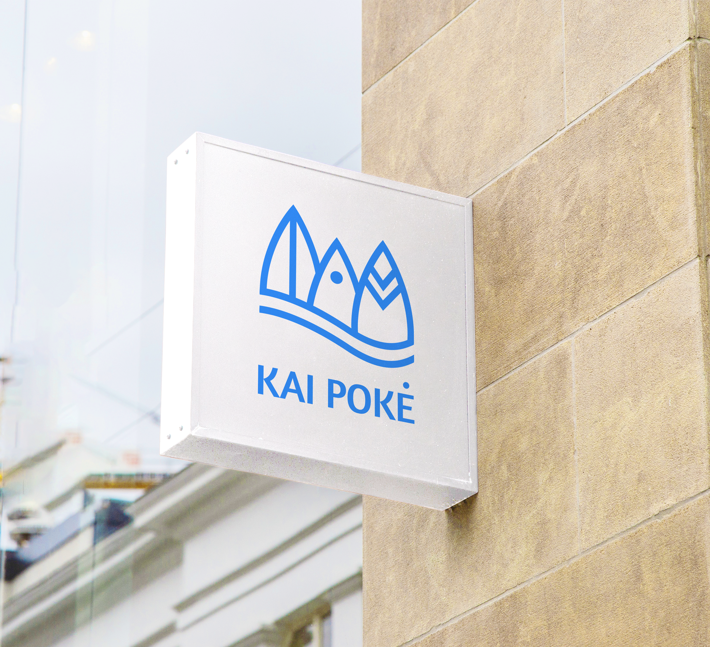
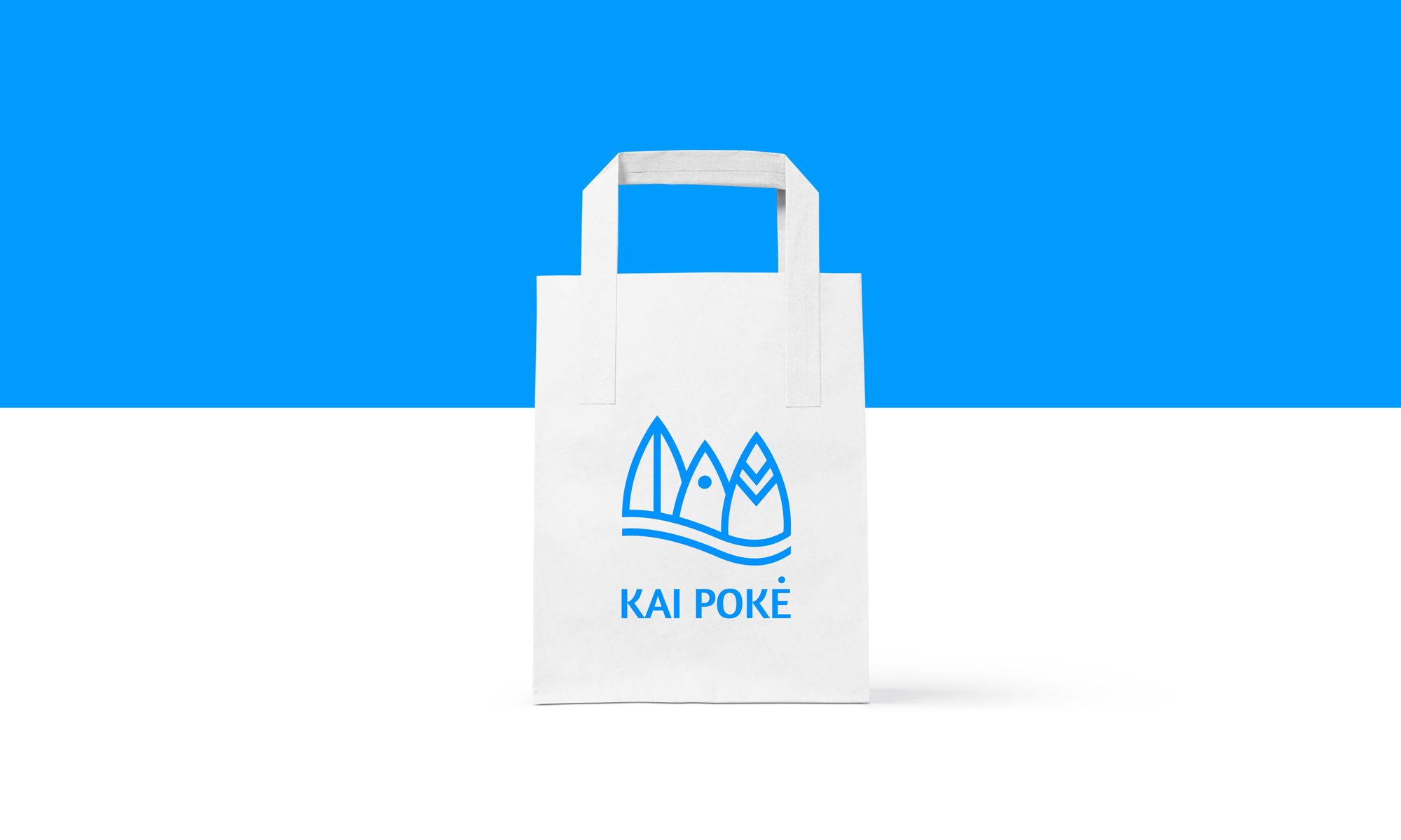
Inspired by the ocean - Kai in Hawaiian language - and its fresh products, the brand is defined by three main values: healthy, fresh and exotic. These have been translated into a unified symbol by designing three similar icons that float on top of a wave to convey the constant movement of the ocean.
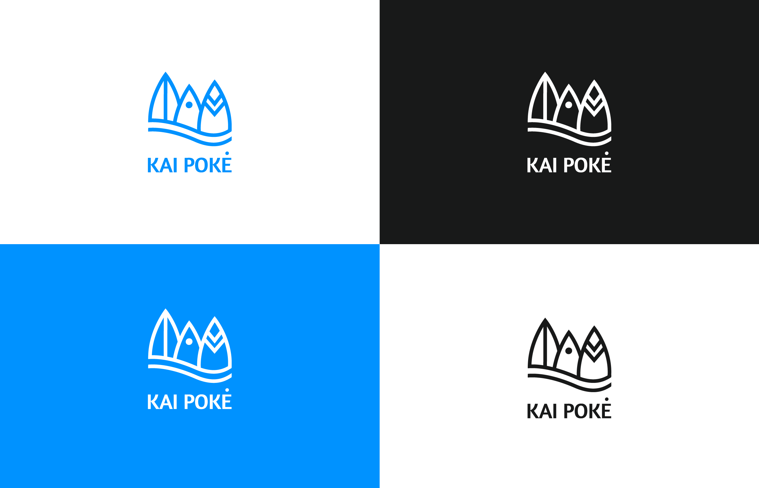
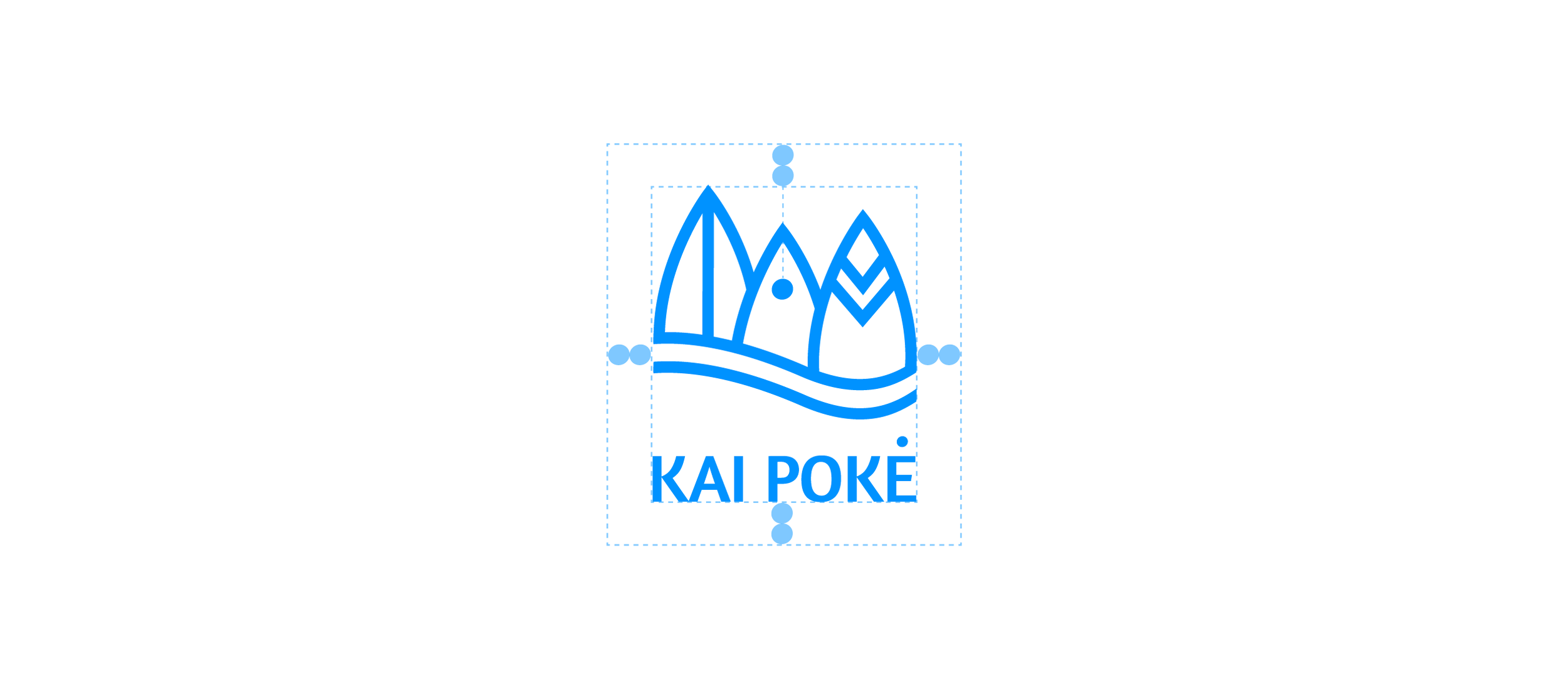
The outcome is a dynamic mark that sits on the words ‘kai poke’ to create balance. The intense blue color creates contrast and is inspired by the sea.
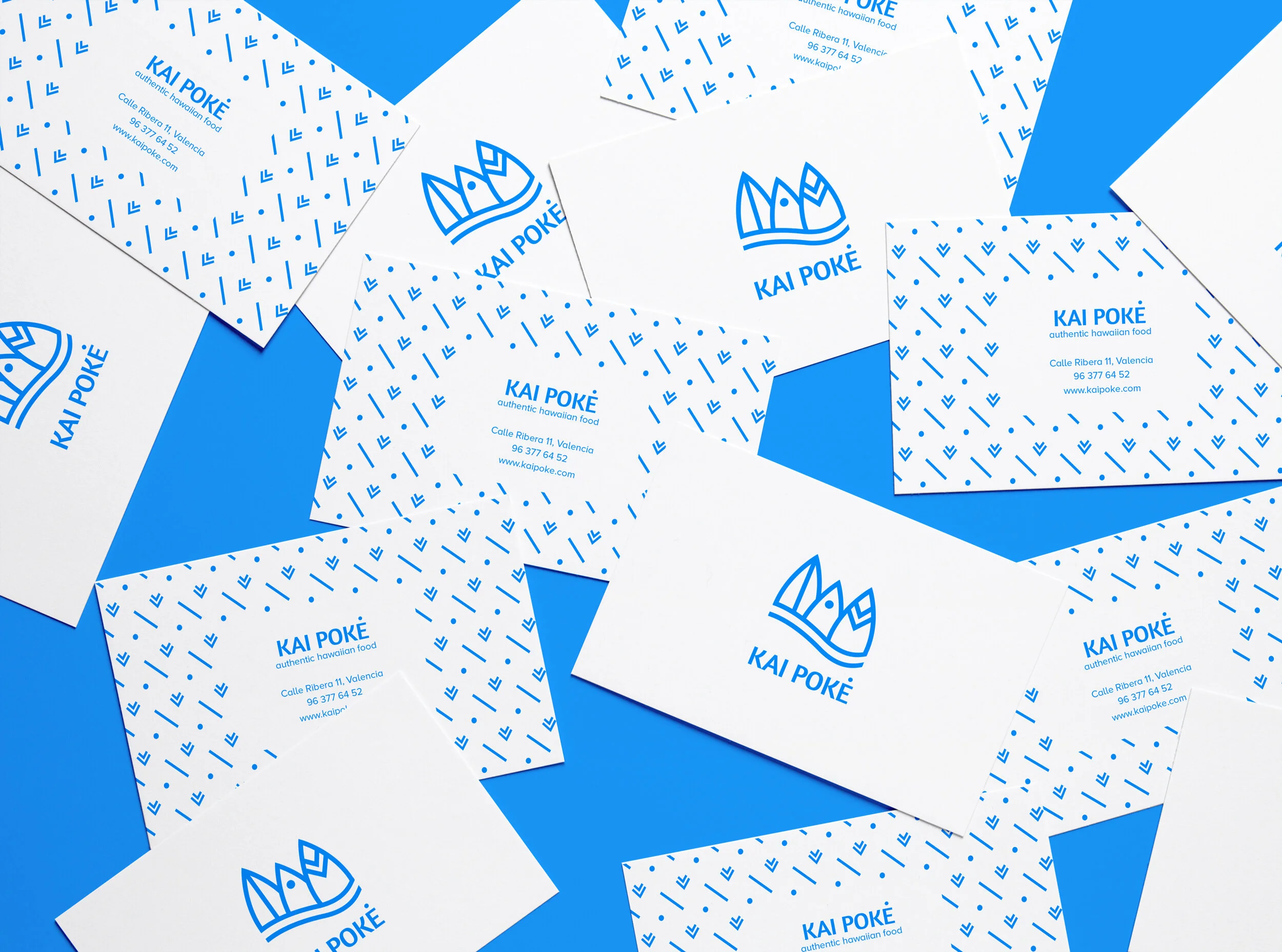
Additionally, a consistent and playful pattern has been designed using the line, dot and ‘v’ shape of the three icons to be implemented in business cards, chopsticks wrappers and other brand materials.