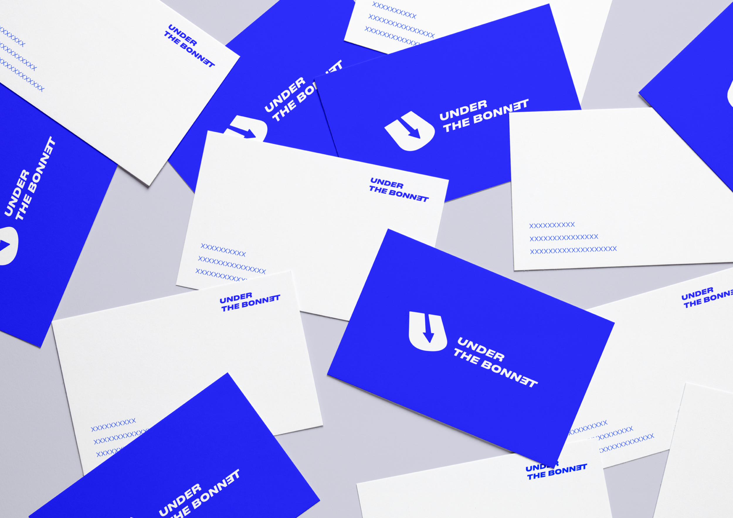
Under the bonnet
Brand Identity
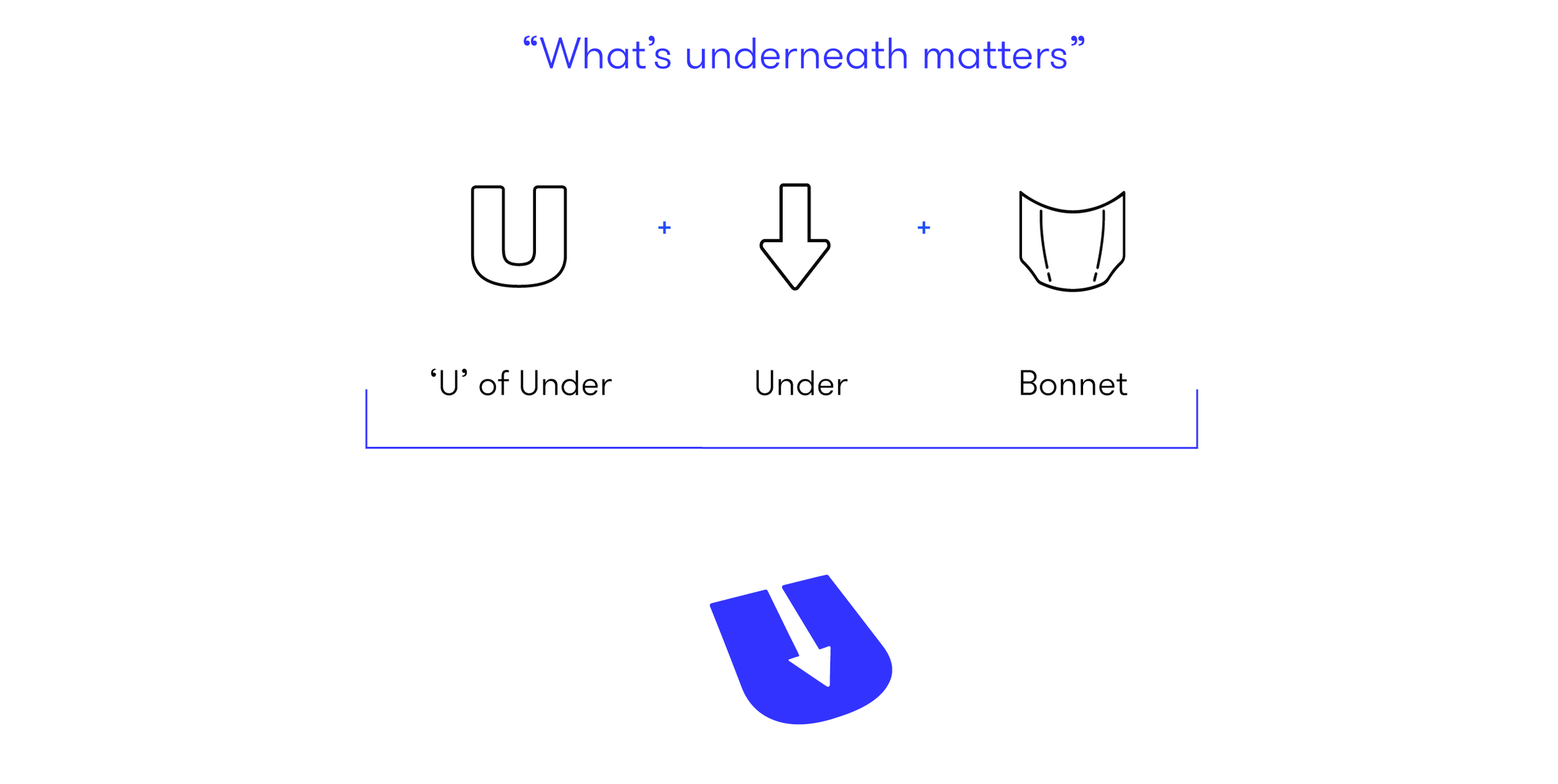
Under The Bonnet is a B2B service that helps businesses grow by improving the user experience of their products and services. They focus their work on all the aspects that are ‘underneath’ the business to identify areas of opportunity.
The symbol of the logo was based on the above. Moreover, the company approaches their method in a way that’s creative, collaborative, brave and disruptive. The wordmark has been customized tweaking the original font to reflect these values and could function with or without the symbol.
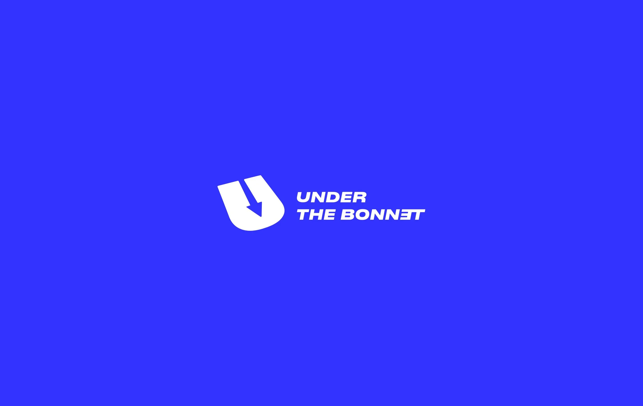
The vibrant blue color represents boldness, the tech world and reliability.
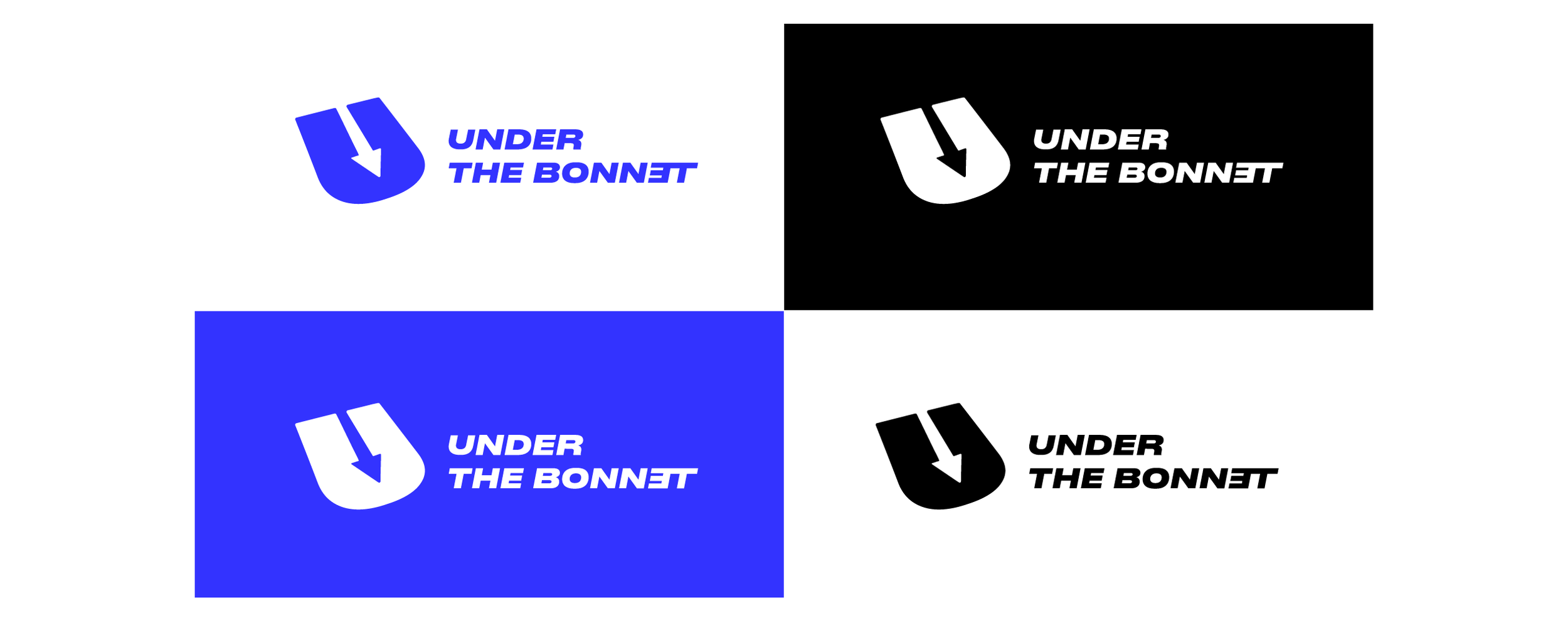
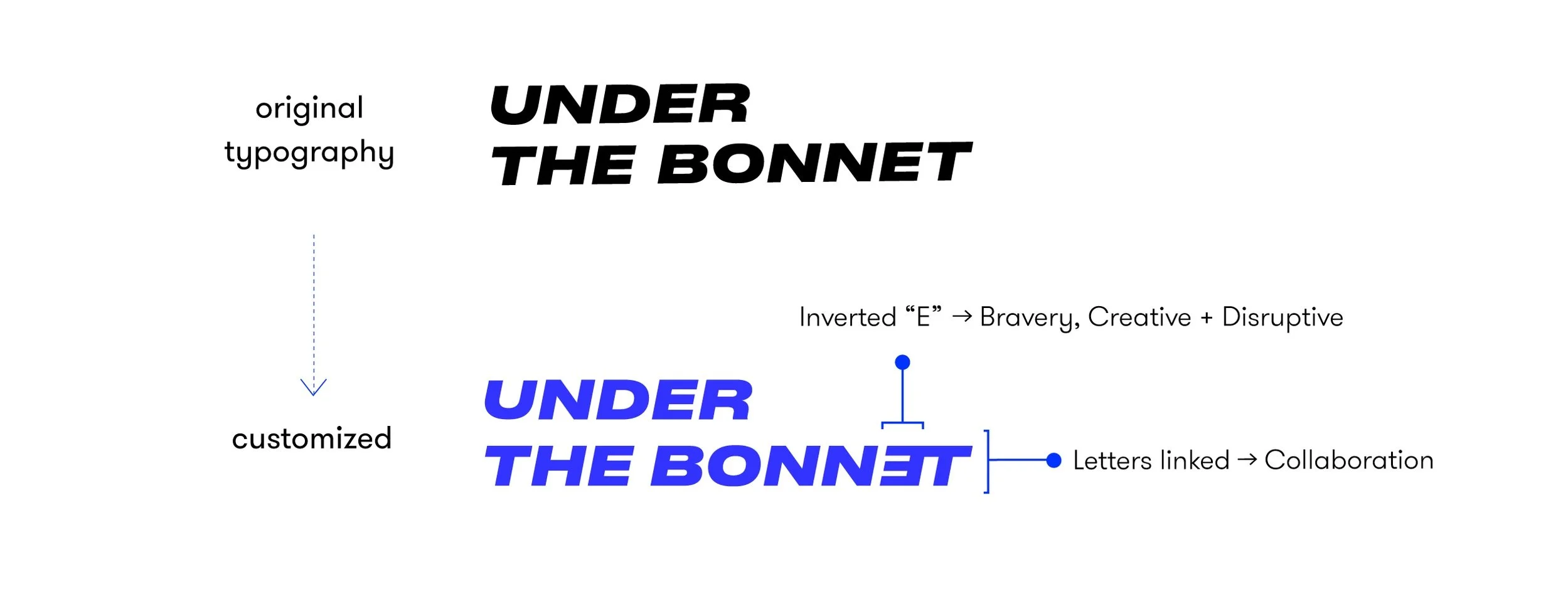
The original font is ‘Druk Wide Heavy Italic’. The original font has been tweaked to be unique and to align to the brand’s values. Its heavy version creates balance with the symbol while representing boldness and bravery, key principles that describe ‘Under The Bonnet’. The ‘Italic’ version is a metaphor of looking to the future and openness to collaboration.